Sign clutter is when there are more traffic signs, road markings and traffic signals than are necessary to convey enough information to allow a road user to drive safely. Over time, signs can be added without consideration to existing signs, or old signs that are no longer relevant are not removed, leading to an increasing number of signs that detracts from the visual aesthetic of the environment and causes confusion or sign overload among drivers.
Let’s find out what causes sign clutter and what the Department for Transport advises can be done to alleviate it.
Signs are ways of conveying information and therefore they should be of consistent and clear design in predictable places, maintained and kept clean, and unambiguous in their meaning. Traffic signs are places by the traffic authority through the powers provided by the Road Traffic Regulation Act 1984. While there’s no legal obligation to provide signs, the signs that are provided intend to give details on restrictions to road users, and any warnings.
If a Traffic Regulation Order (TRO) has been made, then a sign or marking is required, and these are only where a clear need has been identified, for example, where not alerting drivers could cause an accident if the road is difficult to read.
Unlawful traffic signs are removed where they cause confusion or danger, though this doesn’t always happen quickly.
Consistency of design

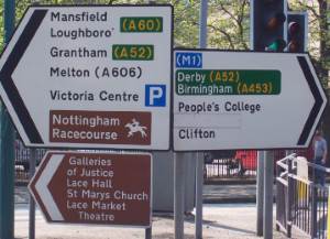
Sign design should be consistent. If the design isn’t consistent motorists have to first read the words, then interpret the meaning. If the design is consistent the design conveys the meaning and the words support it, which takes less processing power in your brain. This sign in Nottingham is an example of a poorly executed sign. Not only is there a lot of information, possibly some of it irrelevant such as where St Mary’s Church is, it shows different ways of describing destinations.
The sign on the right has the destinations in white with a green background whereas the sign on the left has the destination in black on a white background. On the left the large sign has a destination of interest in white on brown, but immediately underneath there’s a dedicated sign with much more information in white on brown. This sign cluster should be redesigned to be consistent, and it looks like an example of where signage has been added over time without taking into consideration what was there before.
Tourist destination signs are gradually becoming redundant as tourists have smartphones with apps for navigation and tourist information. In most cases it’s likely that road signs are only relevant in the last couple of miles, or where a visitor might need to turn off a main road onto a B road and the location isn’t clear. Tourist destinations, though, will argue against this as it reduces their general visibility to the public.
Size
In general, larger signs are needed on faster roads because drivers will need more time to see them. Visual clutter can be reduced with smaller signage on slower roads.
Temporary signs left behind
How many times are you driving along a road and see a road works sign with no apparent road works? This causes no end of frustration for drivers who simply are conditioned to ignore road works signs unless the works are already visible. And even if they are visible, drivers become accustomed to driving as if there are none. This can create elevated danger for road workers and for the drivers who may hit a patch of gravel unexpectedly.
Regulatory signs
 Regulatory signs give instructions that help road users comply with the law. They might, for example, show that you must pass to the left of a traffic island. However, many of these signs are virtually redundant when the road itself offers little in the way of allowing drivers to do anything but adhere to the rules. In the case of a keep left sign, these can be useful if the layout of a junction could be misinterpreted (especially at night) and result in the driver passing to the right of the sign, but in many cases they are not needed.
Warning signs
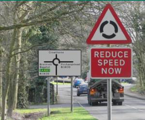
 Warning signs should only be used where there’s a specific safety issue. Common scenarios where signs are placed in redundant locations are when a direction sign indicates a roundabout is ahead, but there’s a warning sign, too.
If it’s absolutely necessary to reduce speed then perhaps the direction sign could be redeveloped to convey that information. Then only one sign needs to be acknowledged and understood by drivers.
Road markings
Worded markings such as ‘keep clear’ and ‘slow’ are often not required as road situations change. For example, if a road in a 50mph zone has marking for ‘slow’ near a junction, and that speed limit is reduced to 30mph, then perhaps the marking is redundant.
Placement
Approval has been given to relax the requirement for many regulatory signs to be place on both sides of the road at the beginning of a restriction, although this doesn’t apply to speed limits. This could reduce the number of signs.
Signs are also placed with minimum clearances: 2.1m over footpaths, 2.3m over cycleways, and set back at least 0.45m from the edge of the carriageway. Signs are generally required to be less than 4m off the ground.
Traffic signals
The minimum requirement for permanent traffic lights is one set at the stop line and another set the other side of the junction. In many places there are more than this. These are not always required, and are costly in terms of power consumed, maintenance, etc.
What are the benefits of reducing sign clutter?
There are several benefits, some of which are more obvious than others.
Reduction in costs
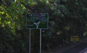
 Signs require maintenance as they decay and degrade over time due to the weather, or they are vandalised or become damaged through accidents or deliberate actions. Fewer signs means fewer people required to maintain them, less cost in purchasing new signs, less cost in trimming foliage around the signs and less cost in lighting signs. As you can see from this image on the A16 approaching Burtons Corner near Boston, the trees are starting to hang down obscuring the sign, which is already partly camouflaged being green in a hedge of green foliage.
50m up the road towards the roundabout there’s a 30mph sign that’s completely obscured by foliage.
Reduction in danger
Signs have to be mounted on poles or gantries and these create objects that vehicles, cyclists and pedestrians (particularly blind pedestrians) can hit.
A reduction in signs also reduces the amount of time a driver has to take his or her eyes off the road. New drivers also find the number of signs overwhelming at times – they are already dealing with driving, which will be unfamiliar to them.
Improvement in traffic flow
When signs are maintained they often require maintenance vehicles to partially or fully block a lane (especially if it’s a gantry sign on a motorway, or lines are being repainted). This holds up traffic and produces an economic cost, as well as frustrating drivers and increasing danger, as mentioned above.
Reduction in environmental impact
Signs take raw materials to make and install. Metal and plastic have to be extracted from the earth and formed into sign shapes. Designers working on computers which use electricity have to create the sign designs, and printers and paint specialists are required to produce the colours that appear on the signs.
Improvement to quality of life
Less signage means less blots on the landscape, particularly in rural areas, thus improving the aesthetic quality of the environment.
