How much information do you need to see in your car? Originally, car designers showed critical information about the car: speed, engine revs and temperature – things that were important either for not breaking the law, or not breaking the car. Over the years we’ve measured more and more about what’s happening in our cars and manufacturers have been keen to show us these, whether they’re useful or not. Being able to see the tyre pressure from within the car is useful, while seeing the instantaneous fuel economy is just of interest but not critical.
There’s now so much information available to the driver that we have to have screens with multiple pages to display it all. Fortunately screens are now very cheap, and they’re appearing not only in the centre of the dashboard to show what radio station we’re listening to, but also replacing the entire instrument panel behind the steering wheel, giving the options for designers to create new types of interfaces to represent the information we need or want to know.
What kind of information does a car display to its driver?
Depending on the price and specification of your vehicle, it could display any of the following in addition to your speed, fuel tank, rev counter and engine temperature:
Satellite navigation: while many people use their phones, sometimes it’s more convenient to use an inbuilt system in the car.
Camera views: most cars now have a reversing camera, but some also have cameras on the front or the wing mirrors
Media selection: are you listening to the radio or a CD, is your iPod or phone plugged into the USB connection, or have you put an SD card into the card reader? You can control these items and quite often the tonal characteristics of the stereo itself.
Temperature: most vehicles will give you an outside temperature and this has a practical purpose as anything under 3 degrees Celsius means there’s a risk of ice. Some will allow you to control the air conditioning using the screen.
Environmental conditions: Some vehicles (most notably four-wheel drives) show altitude, air pressure and a compass bearing
Apps and smartphone connections: Apple CarPlay and Android Auto are systems designed to allow you to control certain functions and apps within your car via the screen
Vehicle performance: some cars will show the tyre pressure, while others display the g-forces acting on the car at that moment in time.
Vehicle setup and preferences: how long do your lights remain on after you’ve turned the car off, do you want your clock in 24-hour format or not, etc?
Engine performance and health: when is the service due, what is the temperature, etc?
Trip computer: how much fuel are you using, how far have you travelled since you last reset the system, how many hours have you been travelling (and should you be taking a break), and what’s the estimated number of kilometres you can travel on the remaining fuel in the tank?
Speed and revs options: not only the actual speed you are doing, but whether you’re using cruise control or a speed limiter. Some systems even know the local speed limit and can advise if you are exceeding it. Some cars (e.g. BMW M3) limit your revs until the engine is warmed up and this is displayed on the rev counter.
Suspension and transmission modes: Some cars have sport and comfort suspension settings, and different options for raising or lowering the ride height (usually on expensive SUVs), and others have different gearbox modes for different types of terrain or driving styles.
Gear: with some cars having up to 9 gears and being exceptionally quiet in the cabin it can be important to know which one you’re in if you are driving it in a manual mode, e.g. when coasting downhill to preserve the brakes.
Internet connection: some cars have the internet (usually via smartphone connection) and you can browse certain websites on-screen.
How is all this vehicle information displayed?
Designers have to create interfaces to display this information. The interfaces consist of graphic elements and text. Often the text and graphics have to have some kind of animation to assist with transitioning between screens. This requires that graphic designers learn kinetic typography and interface design (often called user experience or Ux). Screen designs change as the driver navigates between them, and also sometimes the colours change at night for better readability or less glare (usually navigation systems have this feature most prominently).
The first screens with vehicle information began to appear in vehicles in 1976 and they were basic LCDs like a digital watch. In the last 40 years they have become high definition screens with excellent visibility in any light. The screens are now found in the centre of the dashboard as well as behind the steering wheel, sometimes replacing the whole instrument panel.
Skeuomorphic design
While the first digital readouts simply gave figures, e.g. for speed, with screens, the first designs have mostly been graphical representations of older interfaces showing dials and gauges. As people get used to different forms of display of this information, automakers will have more leeway to create new and more effective designs that convey essential information quickly. When we look at the history of a speedometer, it is circular because the needle used to represent the speed revolved around an axis, but it doesn’t necessarily need to be shown in this way, we’re just used to it.
Newer designs
Newer designs are tending towards simple textual representations of functions with some kind of animation between screens which lets the driver know that information is changing. If the screen just changed, but wasn’t that different to the screen before, drivers who are driving while changing it might not think it has changed.
Examples of instrument panel designs
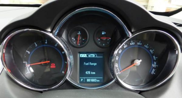
Not all manufacturers are going the route of screens; it’s a trickle down effect with some of the premium manufacturers (notably Audi and Lamborghini) embracing it wholeheartedly, with other manufacturers gradually increasing the size and prominence of their screens. Looking at this screen from a 2016 Holden Cruze (Australian model), you can see a small screen surrounded by four conventional dials. The screen isn’t even that modern-looking, with very basic graphics and a tabbed display which is accessed via a button and collar on the indicator stalk. The screen also shows the gear and the current odometer reading.
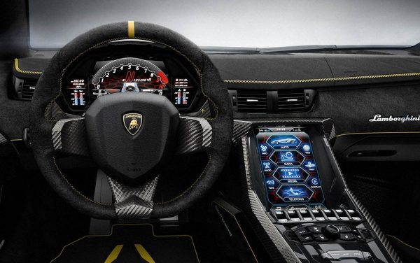
At the other end of the scale we have Lamborghini’s Centenario which has a full screen behind the steering wheel and straddling the space between the dashboard and central binnacle.
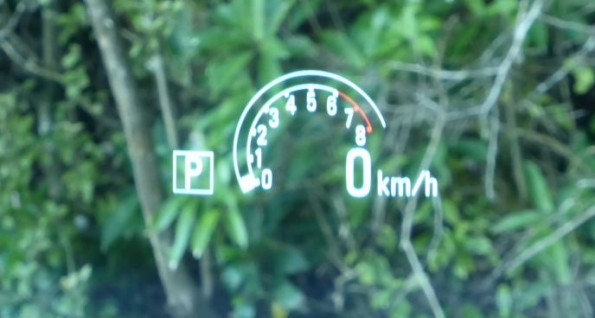
Other vehicles display information using a head-up display, most commonly to display speed, but sometimes also displaying instructions from the navigation system, the current gear and revs.
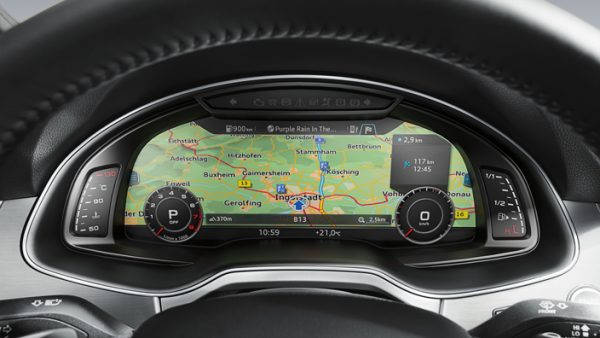
Audi’s Virtual Cockpit is a full system which can convert the entire screen behind the steering wheel into a display for the navigation system or any combination of elements and options.
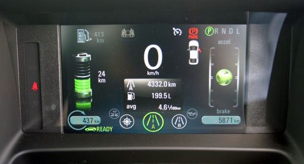
Interface elements like the speedometer are still represented in a conventional way. The Chevrolet Volt takes a different approach in giving some vehicle statistics on a screen on this screen behind the steering wheel, and displaying brake and accelerator usage as a green ball that vertically moves within a gauge. The interface design is a bit of a mess, but it was an early adopter of this type of multi-display screen.
For an example of how motion typography is used in an interface, this video of a Lamborghini accelerating shows the gear selection animating. Jump forwards to 35 seconds and watch as each gear expands and turns red as it is activated. This change in size requires numbers to the right of it to move, too. Font choice, style and colour are important for readability at a glance.
